1300 853 502
Menu
Search
Shopping cart
Filters
Personal menu
Close
Markers
Sketch
Classic
Ciao
Wide
Empty Markers
Sets
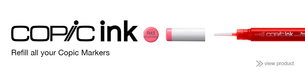
Inks
Refilling Accessories
Ink Sets
Black/Blender
Blue
Blue-Green
Blue-Violet
Cool Grey
Earth Tones
Fluorescent
Green
Neutral Grey
Red
Red-Violet
Toner Grey
Violet
Warm Grey
Yellow
Yellow-Green
Yellow-Red
Pens
Gasenfude
Multiliner
Multiliner SP
Air Brush
Accessories
Books
Surfaces
Nibs
Storage
Opaque White
Copic Plastic Color Chip
Contact
Contact Us
Store Finder
About
Resources
What's On
Menu
Copic
back
Markers
Inks
Pens
Air Brush
Accessories
Contact
Contact Us
Store Finder
About
Resources
What's On
Markers
Inks
Pens
Air Brush
Accessories
Featured Products